Bringing Back The Confidence In Cooking
Amazon Fresh Recipes Website Redesign
Project Overview
Context
This project was assigned to me during my UX Microcrediental course. The purpose was for students to showcase what we've learned in both human-centered design and visual design. We utilized the design process taught in our course: Research, Information Architecture, and Prototype.
The Problem
How might we eliminate the frustration Amazon Fresh users face when searching for recipes so that beginner cooks feel less intimidated by the cooking process?
The Outcome
Our goal was to restructure the information architecture to highlight key information users would need to know at a quick glance.
My Role & Responsibilities
UX Design & Team Lead
User Journey Map
User Stories
Mid & High Fidelity Wireframes
UI Design System
Competitive Analysis
User Interviews
User Survey
Affinity Map
User Persona
Scope & Constraints
Desktop Only: We were free to choose any aspect of the Amazon website to redesign, but were limited to a desktop UI (no apps).
My Team
Afua Laast (UX Researcher)
Linda Parades (UX Designer)
Shushanna Guy (UX Researcher)
Timeline
2 weeks
Tools
Figma
Our Solution
Everything you need to know at a glance.
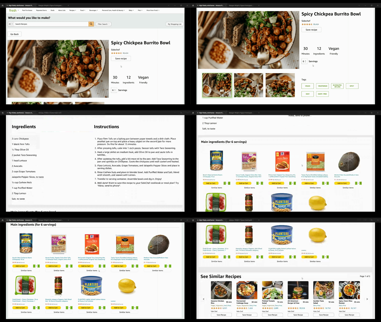
Our goal was to restructure the information architecture to highlight key information users would need to know at a quick glance (i.e time it takes to cook, dietary restrictions, # of steps), and also add new features (i.e. a servings size calculator) that would make searching for and executing recipes, a breeze.

But how did we do it?
The Problem
Learning how to cook as an adult was an aspirational skill, but now the pandemic has people scrambling to learn.
Finding inspiration, buying, and cooking the ingredients needed for a recipe, all in the hopes that it will taste good is a daunting task for beginner cooks. Without being equipped with the necessary tools, all the effort made can be futile if the dish doesn't taste great. It's time for Amazon Fresh to take action and fill that gap with their current recipes page.
How might we eliminate the frustration Amazon Fresh users face when searching for recipes so that beginner cooks feel less intimidated by the cooking process?
Target Audience
In order to better understand who best our redesign would serve, we surveyed 35 men and women who all have some experience cooking (ranging from beginner to intermediate). Their goal is to develop their cooking skills with easy and quick recipes.
01. RESEARCHBehavioral Analysis
Newfound time for newfound interests
To understand what types of problems people were facing when trying to cook, research began with analyzing behaviors and trends amongst American households during the pandemic.
Research showed that because the pandemic has afforded people the opportunity to spend more time at home, Americans are cooking more meals at home, experimenting with flavors and expanding their palettes, and are focused on cooking quality and healthy meals.
Interesting Findings:
PR, H. (2021, January 14). America keeps on cooking. America Keeps On Cooking. Retrieved January 18, 2022, from https://www.prnewswire.com/news-releases/america-keeps-on-cooking-301208005.html?tc=eml_cleartime
Galarza, D. (2021, October 28). Before the coronavirus epidemic, they didn't know how to Cook. now they are scrambling to learn. The Washington Post. Retrieved January 18, 2022, from https://www.washingtonpost.com/news/voraciously/wp/2020/03/27/before-the-coronavirus-epidemic-they-didnt-know-how-to-cook-now-they-are-scrambling-to-learn/
Competitive Analysis
How can we do it better?
It was important for us to understand what platforms and resources were currently available and identify areas where we could improve upon them in our redesign. We conducted market research to compare Amazon Fresh Recipes to its biggest competitors: All Recipes, Yummly, The Food Network, Instacart, and Blue Apron.
The goal was to compare how easy it was to navigate the competitor's website to find a recipe and how easily we found the relevant information need to cook that recipe.
Early Insights:
User Survey
What do people have to say?
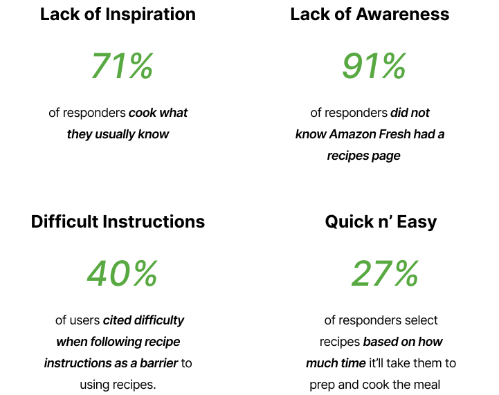
In order to validate our assumptions about possible pain points people might be experiencing when trying to search for recipes, we surveyed 35 men and women ranging from 18-55 who are full-time employees and have had some experience cooking.
Here’s a summary of our insights
User Interviews
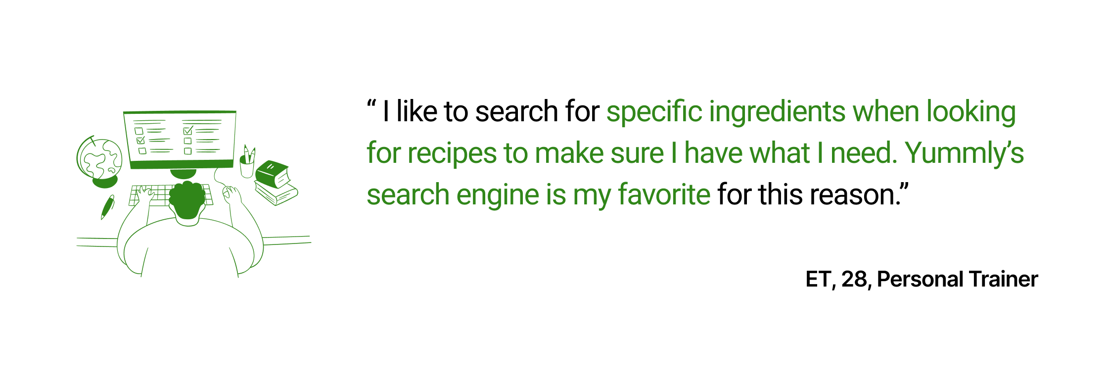
We also interviewed 5 men and women to get some qualitative data in go more in-depth on their survey answers. Here’s what some of them had to say:
'Free vectors icons and illustrations from Streamline https://streamlinehq.com'
All of this data was very insightful as our assumptions were validated and we gained new insights. From this data, we were then ready to create a user persona.
Affinity Mapping
Coming all together now
We then took all of the information gathered from user research and grouped what people had to say to reveal the most common themes and pain points.
02. INFORMATION ARCHITECTUREAffinity Mapping
It all comes down to proficency
My team and I were able to identify two distinct personas among our user data: beginner and intermediate proficiency levels in the kitchen. We decided that our primary persona would be beginner cooks like Wilson as we felt that profile best represented the majority of our users in the data we gathered. We would also be able to identify more opportunities to improve Amazon’s website with this persona.
User Journey Map
Wilson’s journey to find flavor
To further empathize with the users and explore their experiences, we mapped out Wilson’s journey. Our goal was to identify possible pain points someone like Wilson might experience while trying to follow a recipe using Amazon Fresh recipes.
Here’s a summary of our insights:
Paint Point 1: Wilson finds the recipe page layout overwhelming and confusing
Paint Point 2: Wilson finds that the meal he chose took too long to cook because he had to substitute ingredients.
Paint Point 3: Wilson is disappointed by the flavor of the meal because he had to use ingredients he’s never used before.
Brainstorming
Letting our minds run wild
After mapping out his journey, we then began brainstorming possible solutions to his pain points as a team. We did not hold back our ideas and focused on quantity initially. We then refined our ideas by evaluating whether or not each proposed solution directly answered our original problem statement.
User Stories
Getting our priorities in order
After generating all of our great ideas, it was time to filter and refine. Since time was a constraint, we could not incorporate all of our features into this project. We wanted our redesign to be a minimum viable product to create the most impact for our users. User stories gave us clarity on which features to focus on. Thinking from the perspective of our users reduced our designer bias focus on what users truly needed.
We made each feature generated from our initial brainstorm into a story and then categorized it as either high, medium, or low priority.
After our evaluation, we focused on this user story:
As a busy professional, I want to quickly scan through key information on the recipes page so I can easily find what I need.
From this, we were able to identify the key must-have features:
Clear and comprehensive menu categorization
A section highlighting key information at a glance (time, # of steps, diet)
Enticing pictures of food
Rating system
We also identified some nice to have’s:
Serving size calculator
Reviews section
03. VISUAL DESIGNWireframes
Low and mid-fidelity wireframes
We began our low fidelity wireframes by doing crazy 8’s to see how many ideas we each could come up with. We then reviewed each other’s work and incorporated the best parts of each into our mid-fidelity wireframes.
Final Design
Final Design
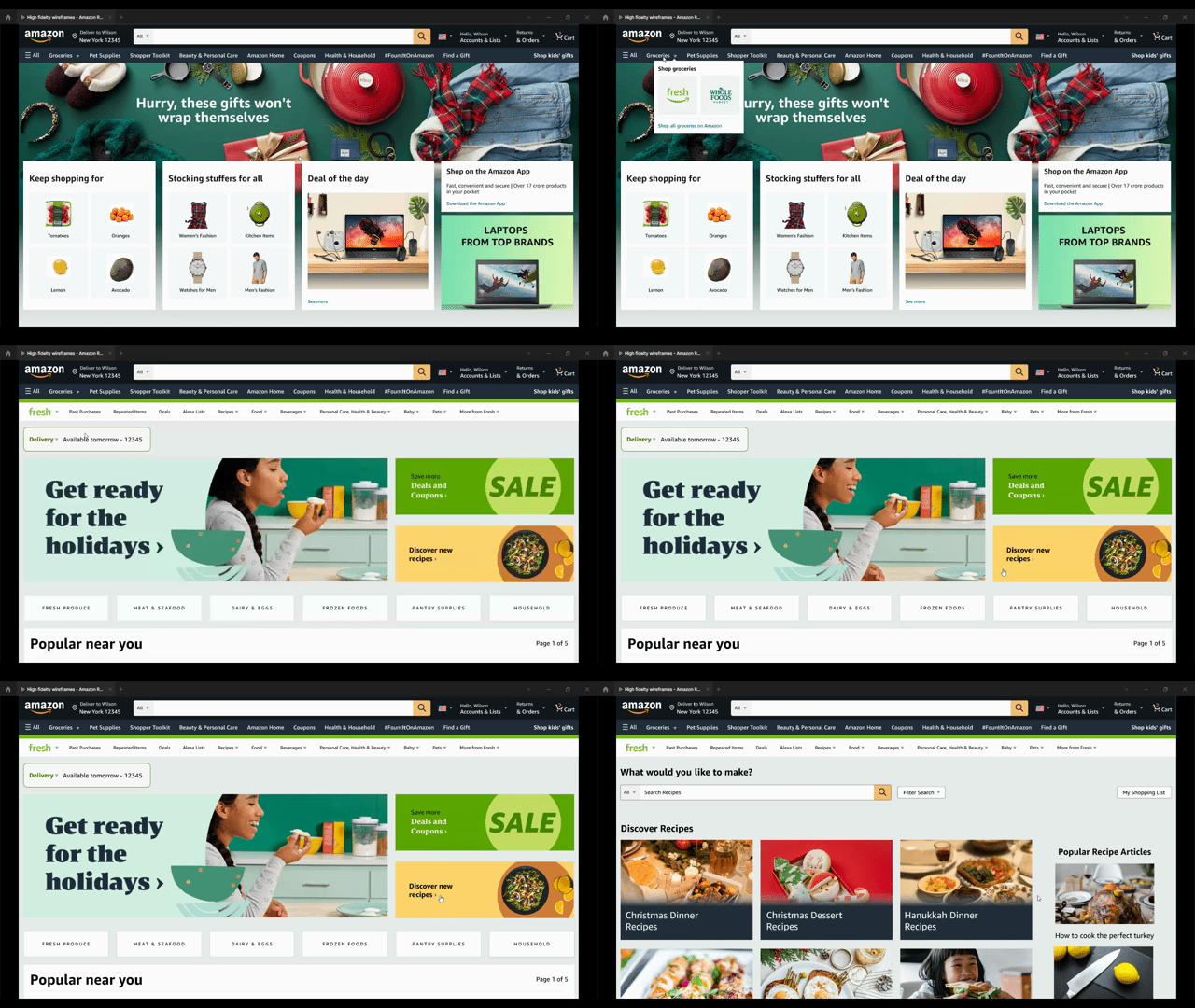
01. Raising Awareness
When using Amazon Fresh, Wilson didn't know Amazon had a recipes page because he wasn't a prime member.
Now, Wilson and other Amazon users can access the recipes page regardless of membership status.
A banner was added to advertise the existence of the recipes page, making it easily accessible to Amazon Fresh users.
02. Search with ease
Before, Amazon had a very limited menu categorization that was very confusing to navigate.
Now, Wilson can search for recipes that are based on
his proficiency level (e.g. beginner, intermediate, advanced)
which ingredient he wants to include or exclude
the type of cuisine he’s craving (e.g. Asian, Mexican, Italian, etc.)
the course he wants (e.g. breakfast, lunch dinner, etc.)
much more
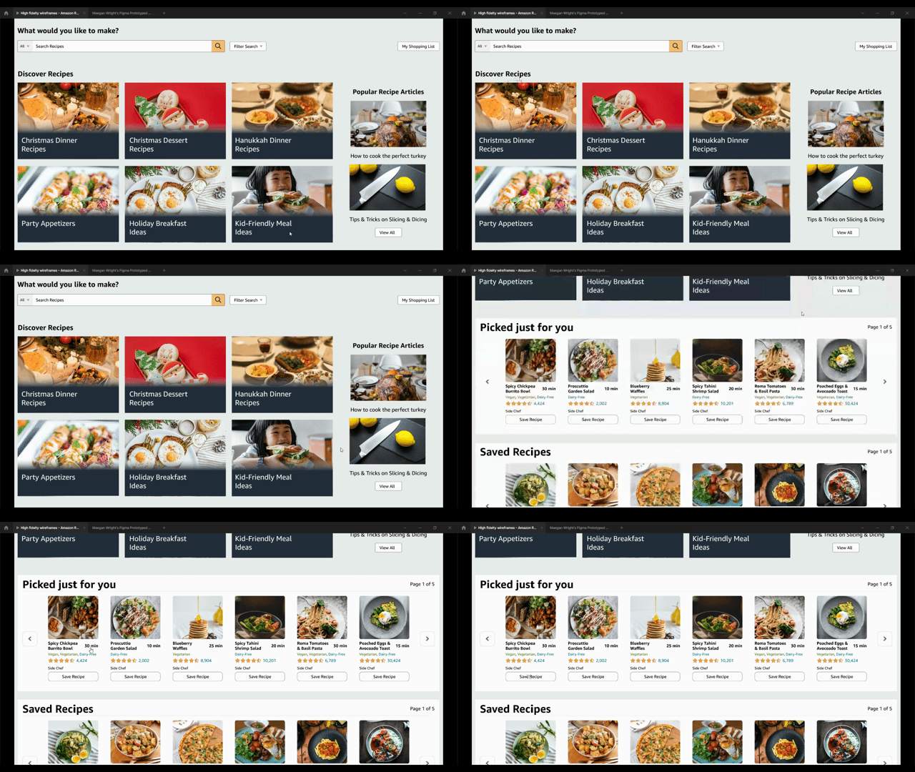
03. A new way to discover recipes
Wilson can now see curated lists of recipes on the homepage that change ever so often depending on what Amazon wishes to promote to its users. He can also view popular articles to learn tips and tricks about cooking. In addition, he has a personalized recipe recommendation section that's based on recipes he has previously searched for and can now easily save recipes he wants to try.
Wilson no longer has to wonder if a recipe is good with the addition of a 5-star rating system.
He can also see how much time it takes to cook, dietary restrictions, where the recipe came from, and preview the ingredients list by hovering over a recipe.
04. Clear and concise information
On the recipe page, Wilson can now see multiple images of the final product. He can also change the serving size of a recipe without having to recalculate measurements.
04. ReflectionLessons Learned
Celebrate good times
I completed my first UX Design case study (yay!!) and I’m very proud of the work my team and I produced. When presenting it to our classmates, we received a lot of positive feedback which was really rewarding. Doing this redesign was a fun and worthwhile experience, but I would be lying if I said there weren’t moments of hardship. Here are some things I learned:
Plan, plan, and plan again
Big projects, such as this one, can easily make anyone feel overwhelmed. It was important for me, as team leader, to organize and prioritize my team’s tasks and deliverables from the beginning so we could work as efficiently and effectively as possible. Because so that my team and I knew what we had to do and when we had to complete it, we were able to execute a successful project.
Collaboration and communication
As I come from a graphic design background, I’m used to working on solo projects with feedback only from my superior. The UX process is completely opposite from that, so I had to learn how to rely on others for support and compromise on my ideas so that my team members' voices ideas and opinions are heard and utilized.
What Would I Do Differently?
Getting feedback
User testing is a vital part of the UX process, so not having the time to incorporate feedback from our users was unfortunate. If there was more time to complete the project, I would prioritize user feedback. I would as users to complete such tasks as:
Navigate to the Recipes page
Find an article that teaches you how to use a knife
Customize the serving size of the recipe
After testing, I would ask them questions such as:
What was your overall impression of the Amazon Fresh recipes page?
What was the best/worst thing about Amazon Fresh recipes page?
How would you change Amazon Fresh recipes page?
How would you compare Amazon Fresh recipes page to AllRecipes?


